Pull out your phone and search for a local restaurant, mechanic, or law firm. Chances are, the first few websites you visit will either load cleanly on your screen or frustrate you with tiny text, broken layouts, or sluggish response. If it's the latter, you'll likely move on without a second thought. This is the reality businesses face today. If your website doesn’t work well on mobile, you’re not just behind—you’re invisible to a large portion of your market.
"Having a mobile-friendly website isn't about staying trendy. It’s about meeting basic expectations and staying accessible to the people who matter most—your customers."
1. Mobile Is No Longer Secondary
It’s common knowledge in professional circles that mobile traffic has surpassed desktop. But this isn't just a statistic—it’s a behavioral shift. People browse, compare, and even make high-value purchases from their phones. Mobile isn’t a supplement to desktop usage anymore. For many users, it’s the primary, if not the only, way they interact with the web.
Businesses that design solely for desktop users are making a costly assumption: that customers will tolerate poor mobile experiences. They won’t. Not when competitors are just a click away and loading times are measured in seconds, not patience.
2. User Experience Shapes Perception
You can have the best product or service in your category, but if your website is slow, hard to navigate, or visually broken on a mobile screen, you’ve already lost credibility. Visitors judge the professionalism of a business by how well its website works—especially on mobile.
Mobile-friendly websites adapt to screen sizes, load quickly, present content clearly, and make navigation intuitive. These aren’t just nice features—they are core to how users evaluate trustworthiness.
3. Search Engines Penalize Poor Mobile Design
Google uses mobile-first indexing. This means the mobile version of your website is the primary version considered for ranking in search results. If your mobile site is incomplete, outdated, or poorly optimized, your visibility in organic search will suffer—even if your desktop site is flawless.
Search visibility isn’t just a technical detail—it directly impacts your ability to attract new business. A mobile-friendly site doesn't just benefit the user; it aligns with how search engines measure quality.
4. Mobile Users Behave Differently—And Often Convert Faster
Desktop users tend to browse, research, and compare over longer sessions. Mobile users, on the other hand, often act with more immediacy. They’re looking for answers, directions, contact info, or quick solutions.
This behavioral difference means your mobile site should prioritize clarity and action. Easy-to-tap buttons, streamlined contact forms, and fast-loading pages don’t just improve experience—they improve conversion.
5. Social Media and Ads Drive Mobile Traffic
Whether you're running paid campaigns or simply have an active social media presence, most of the traffic from platforms like Facebook, Instagram, LinkedIn, or even Google Ads arrives via mobile devices.
A mobile-friendly site ensures your investment in digital outreach doesn’t go unrewarded. It completes the funnel by giving mobile users an environment they can actually use, explore, and convert through.
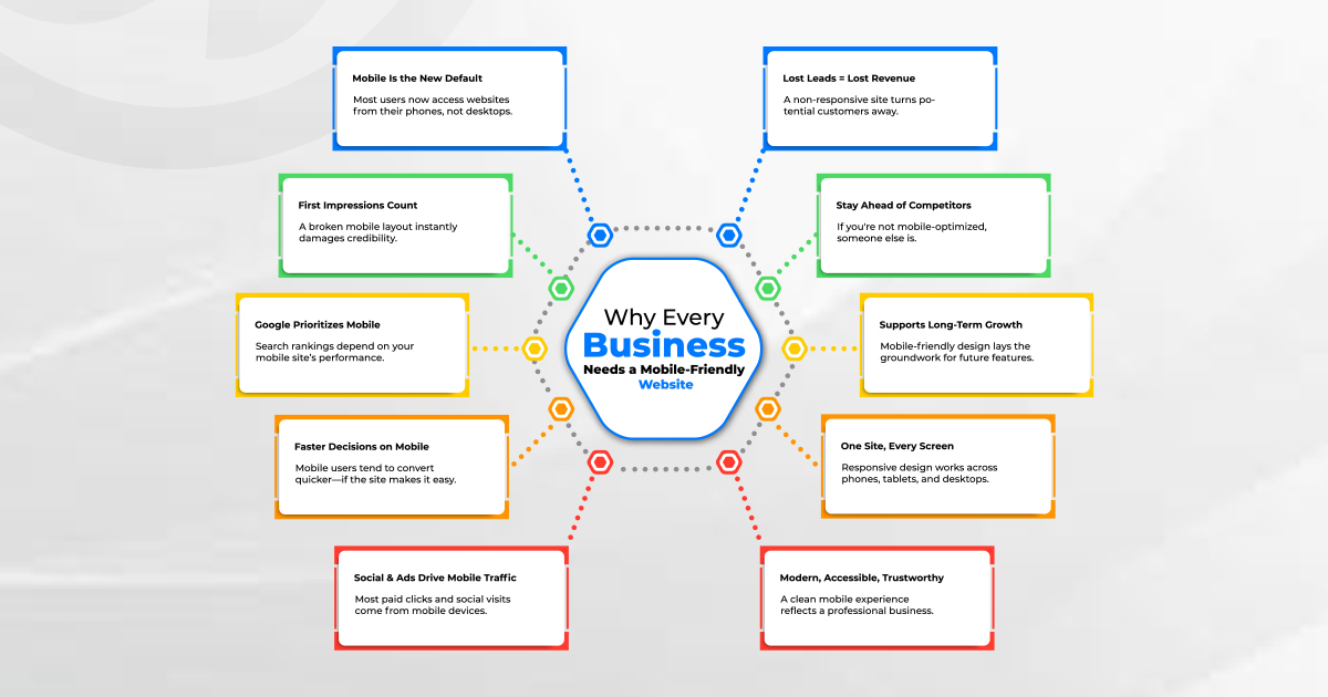
6. Competitors Are Already Ahead
Mobile optimization is not a cutting-edge strategy—it’s standard operating procedure. Most of your competitors already have mobile-friendly websites. If you don’t, you're not just behind technologically—you're handing over opportunities that should have been yours.
A clean, mobile-ready site doesn't just keep you in the race—it gives you a foundation to outperform others in design, speed, and user satisfaction.
7. It’s a Foundation for Future Growth
Web technologies evolve rapidly, and businesses that keep their websites responsive and mobile-compatible are better prepared to integrate with modern tools.
Trying to retrofit new capabilities into an outdated or non-responsive design leads to technical debt, increased maintenance costs, and avoidable frustration.
8. Accessibility and Inclusion Matter
A mobile-friendly site isn’t just about aesthetics or convenience—it’s part of creating an accessible digital environment. Many users rely on assistive technologies or non-traditional devices.
This isn’t just good business practice—it reflects a level of care and responsibility that modern consumers respect. In some sectors, it can even help you meet regulatory or legal standards tied to digital accessibility.
9. Mobile-Friendly Doesn’t Mean Mobile-Only
It’s important to clarify: mobile optimization doesn't mean abandoning the desktop experience. It means your site works well everywhere. Responsive design adjusts layouts fluidly depending on the device.
Businesses don’t need separate websites for mobile and desktop. What they need is one intelligently designed system that adapts to users—wherever they are.
10. It’s Simpler and More Affordable Than You Think
Modern frameworks and content management systems come equipped with mobile responsiveness as a baseline feature. Whether you’re working with WordPress, Shopify, Webflow, or a custom-built solution, mobile-friendly design isn’t complicated to implement—it just requires attention to detail.
You don’t need to rebuild your entire online presence to achieve mobile compatibility. Often, improvements can be phased in—starting with navigation, loading speed, and responsive layout.
Final Thoughts
A mobile-friendly website is not an upgrade or a luxury—it’s the minimum standard for doing business online today. It directly influences how customers perceive you, how search engines rank you, and how effectively your marketing converts.
Ignoring mobile optimization doesn’t just result in missed opportunities. It sends a message: that your business is not ready to meet modern demands. And that’s a message few businesses can afford to send.
Investing in a well-structured, mobile-responsive site is not just about keeping up. It’s about leading with intention—ensuring your digital front door is open, accessible, and ready for the customers already knocking.